Lessons learned from a game jam
Recently, I took part in the 37th Godot Wild Jam with some friends. The objective of the game jam was to make a game with the theme given, it being "Into the machine", but also use the Godot game engine to make it. For it, I did programming, art and even music for the first time!
Our game, Pachinkomonium!, is a 2D platformer/pinball game, where you use pinball-physics and a grappling hook to fling yourself upwards. My pals actually thought about the idea of being inside a pinball/pachinko machine before I joined the discussion. The idea reminded me of Sonic Spinball, a Sonic game that I played years ago, so I thought it was pretty good.
For the graphics, I wanted accurate shading without drawing anything. As I had experience in Blender, I tried doing them with it. The graphics are actually simple 3D models with some drawings on top to make them look more 2D.
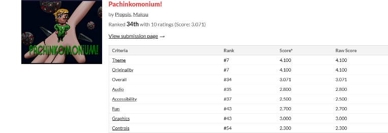
It got an overall ranking of 34th out of 60, as shown by the picture. It was also graded on 7 other categories; originality, theme, audio, accessibility, fun, graphics and controls. Even though it’s not a competition, these ratings can help us guess where we can improve.

Here are my impressions from these ratings:
- Wasn’t expecting Originality to be so high! What, haven’t y’all played Sonic Spinball before? Well, it’s not like you’re missing anything. But if someone was to make a better version of it, it would probably have niche appeal.
- Audio was alright, as expected. When you do something for the first time, it’s not going to be great. That’s not an insult, it’s a fact. I’ll just keep doing them and learn while doing it.
- Very disappointed that Graphics are so low, because I spent a lot of time making them. I’m not sure exactly why this is, though. Maybe it could be that everyone else's art was better? If you have a clue, comment please!
Here are some things I learned for the next time I’m making a game, unordered:
- Choose the colours before you start making assets. I think the art of the game could've looked much better if I took my time to choose colours that go better together and fit the mood. The current ones are fine, but next time I'll be sure to remember to do this.
- Those balls are REALLY annoying. Now that I’m playing it again, it’s really annoying how the balls just stuns you. And when you’re stunned, it snowballs into you, hitting more balls and falling down into the bottom. Perhaps they should do something less harsh, like just block your grappling hook or something.
- Should’ve put a tutorial in the game. This ain’t the 00s any more, and even then some games had tutorials in them! Or at least some button prompts.
- Probably should’ve used rigify instead of skin modifiers autorig. I can’t describe how tedious it was to rotate each bone individually to make a pose for the character. I thought that setting up Rigify might take too much time, so I didn’t bother, but I most certainly would have preferred rigify.
- Make the outlines in-game with a shader. When you scale the assets (like with the MEGAFLIPPER towards the end) it becomes obvious that the assets are just 2D sprites as the outline scales with them. I’ll just use a simple outline shader next time.
Alright, those were some things I could think up, along with some problems people brought up a lot. Perhaps next time will be better.


